

Using The Charts API To Display Stacked Bars
Using The Charts API To Display Stacked Bars
Daily Coding Tip 143

First I need a way of storing data to display on my chart.
The data I want to display is pretty simple: it’s a record of how close I am to keeping my promise on Daily Coding Tips. There have been 120 days since I started writing these in April 2022, and this is the 96th Daily Coding Tip. Of my 24 days off, 12 were spent out of the country without access to a Mac, and 6 were spent trying to move house before the end of my contract.
The rest were either times I was without a Mac or without any free time in the day to write.
Now that I’m tracking this data, I can hopefully reduce the proportion of days that are skipped for the rest of the year.
I’m starting with an enum that defines three categories for my data. There either is or isn’t a tip, and I have an extra case for all of the data combined. This will be a stacked bar that combines both of the other cases, but I’m getting ahead of myself.
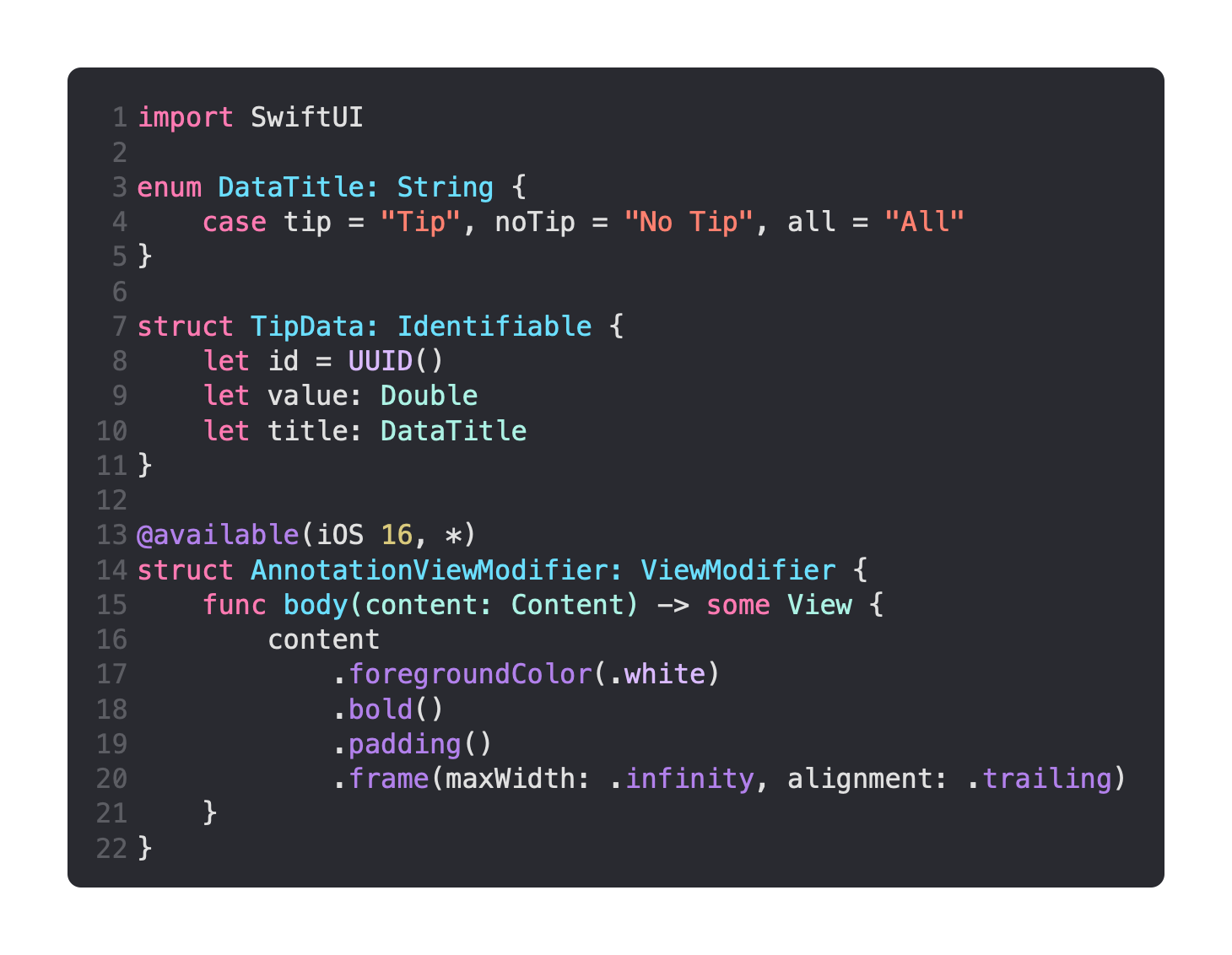
I’ve also included an AnnotationViewModifier which will be applied to annotations that appear on the chart.
Remember to import Charts when you need to use this new API.
The data is stored as an array of TipData, although I only have two data points (tip or no tip). At the top I have the stacked bar, and you’ll notice that the stacked bar is at the top. Because the y axis is always DataTitle.all.rawValue, it is always equal to “All”. Because this title is the same for both .tip and .noTip, the bars are combined on a single line.
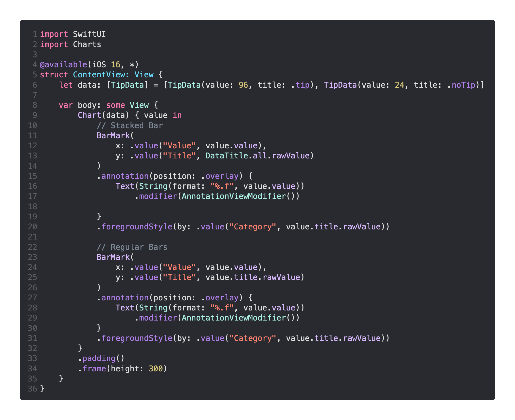
The regular bars are below the stacked bars, and the only difference is that the value, which is passed into the body of the Chart, uses its title.rawValue on the y axis.
This is applied once for .tip and once for .noTip, creating two bars:
