

Proportional Padding That Scales With a SwiftUI View
Proportional Padding That Scales With a SwiftUI View
Daily Coding Tip 093


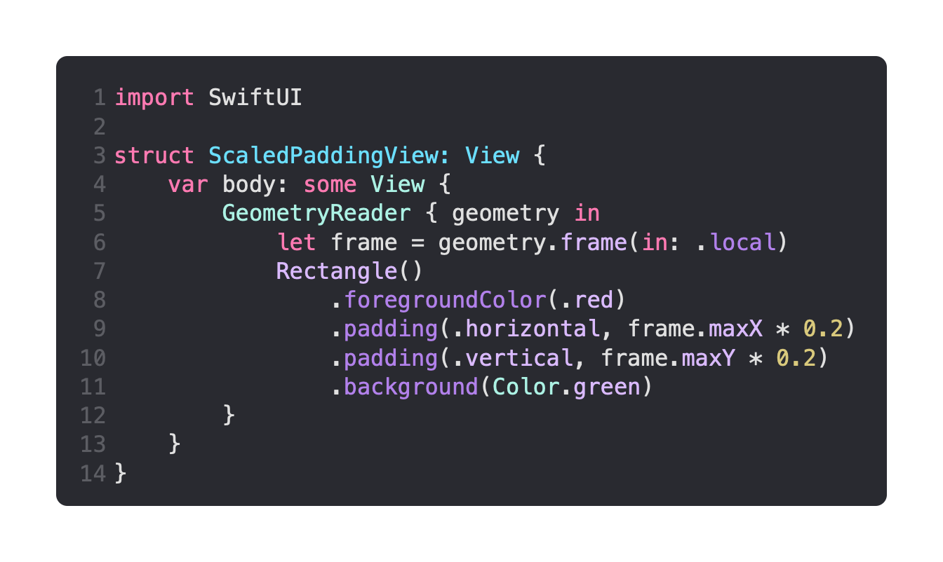
This is the view that is going to demonstrate this technique.
It consists of a GeometryReader, inside of which is a Rectangle with a red foreground colour. This is then given horizontal and vertical padding that is scaled to 0.2 or 20% of the local frame. A green background is then added after the padding, as this makes it obvious where the padding is within the view.
We’re going to be putting ScaledPaddingView as the background of two sliders.
These sliders control the width and height of the ScaledPaddingView, and using it as a background means that changing the size does not affect the size of the overall layout.
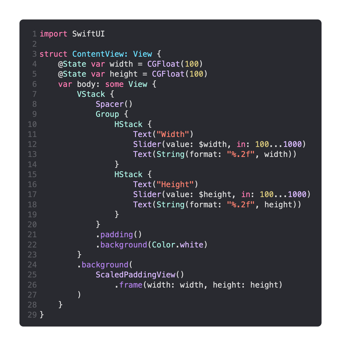
You should be able to run the app now, and the sliders should show that the padding scales to 20% of the available space.
You could use a different percentage for the padding, say 30% horizontally and 10% vertically.